Size of Elements in Musicnizer
Depending on your screen resolution and individual preferences, you may want to make certain elements of the music organizer bigger or smaller. This article will help you with such adjustments.
Menus and texts
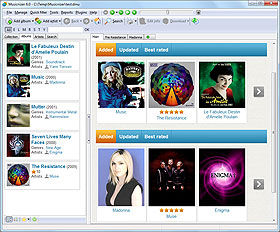
First of all, there is the menu bar and other text labels:

These elements use the common interface of Windows and thus are controlled by the system. You can adjust their size by right-clicking your Desktop in Windows and choosing "Personalize" or "Properties". Look for display properties. In Windows 8.1, display properties look like this:

Here, you can change size of all elements in the system (including icons and other graphical things) or adjust size only of text-based elements (menus, messages, etc.). This has effect on all programs (with a few exceptions).
Toolbar icons
The size of icons on the main toolbar of Musicnizer can be adjusted. Right-click somewhere on the toolbar to open the special menu:

There are 3 available sizes: big icons, medium icons and small icons. Click on the corresponding entry to select the size. Changes are applied immediately.
Font size and text density
The settings described in the "Menus and texts" section above do not apply to the areas where Musicnizer shows information about albums and artists: covers, photos, album reviews, discographies, etc. Elements in these areas are controlled by the active user interface script (theme).
By default, the Breeze user interface is suggested. In its settings, you can adjust font size and text density for pages of albums and artists.
Press F10 (or select "Tools" - "Options"), then switch to the "User interface" tab. Click the "Settings" button below the list of the available interfaces.
This opens the "User interface settings" window.

Find the options highlighted on the screenshot above:
- Line spacing. This defines how much free space should be left between two lines of text. The default value is 2. By reducing it you can make text (like album reviews and biographies of artists) denser. As a result, more lines of text will fit the visible area of your screen, but generally more free space looks nicer.
- Basic font size. There are many different elements of text in Musicnizer: various headers, body text, list headers, discography items, etc. The basic font size setting allows changing them all by changing a single value. Increase this value if you'd like to have bigger letters, or reduce it to make all fonts smaller.
Covers and photos
The user interface settings window that we have just opened in the previous section offers some options to control size of album covers and photos of actors. The "Cover/photo width in the list" option applies to the detailed list mode:

It has effect both on albums and on artists. 80 is the default value (in pixels). You can increase it to make covers bigger (proportionally), or increase the value to make covers and photos smaller.
On the right of the "User interface settings" window, there is an area that controls size of photos and covers in the cover list mode:

By increasing the values you can make covers and photos in the cover list mode bigger. Here you can set both width and height. Make sure that your dimensions of "cover cell" is always bigger than dimensions of covers and photos. A "cover cell" is the place where a cover or a photo together with the corresponding title / name are put into.

If the "Cut covers..." / "Cut photos..." boxes are checked, Musicnizer will resize images proportionally, cutting off some parts that do not fit the dimensions you provided. If the boxes are empty, Musicnizer will resize images without cutting, which does not guarantee keeping their proportions.
